Monday, 20 August 2012

Sizing and Slicing 3DS Max Model

 Here are some development shots of dimensioning and slicing the 3DS Max hero model into pieces for Illustrator

The dimensioning cube - to get the sizes right in 3DS Max

Getting the dimensions right


Slicing


Sunday, 19 August 2012

Acrylic Model Precedents

I found some interesting acrylic models that I decided to use as precedents for their simplicity and elegance. Because one of my three words for my original model was "flux" I think that I would like to mold the plastic using heat to give it a fluid effect that I felt my original model showed so well


Saturday, 18 August 2012

Hero Shot

Here is the Hero Shot for my DSDN104 Project 1:


Here I maintained the idea of a fire in the desert quite literally, and used a blizzard particle render effect to give the model the appearance of being on fire which also turned out to be an effective and beautiful way of lighting my model, in combination with the fiery edgings on the model they captivated my vision of "incendiary".

Along with the aforementioned effect of the fire in the desert I used purple texturing, luminance, glossy and glow effects to further give my model that sense of enticement. Whether a traveler would be attracted to the warm glow, the standoffish jagged edges surrounding a curious interior (much like a rose in thorns), the promise of psychedelia or the unnatural glow, I feel that these elements relate well to both my precedent and my word "entice"

For "fungus", I feel like my model looks quite like a mushroom, which ties in with both the words, the idea of enticement for the purposes of psychedelia, and in turn relates to the precedent image.


The 81

Here are my final 81 images for DSDN104 Project 1:


 I really like the idea I mentioned before about a campfire in the desert, and I wanted to arrange my 81 such that they resembled a campfire in a dark desert. The models are arranged such that the families are in lines outward from the original model in red in the middle, and get progressively lighter in colour the more they change and the hero model is in it's place in the family lit with a purple spotlight. I wanted to keep the background really dark so it appeared to be night-time to further give that sense on enticement and attraction, and the idea of a fire also worked with my word "incendiary". I also decided to make my own desert in 3DS Max using textures and mapping so that I could arrange the models so that I could use lighting and position the models to give the the image a sense of depth

Testing Scenery

 I wanted to put the final model in a scenario that would enhance the models "enticement", and I thought that because of it's glowing, incendiary nature a low-light situation would be best. I recalled when I was overseas camping in the Arabian Desert how the campfires that we had at night-time always attracted a crowd - whether it was people, animals or bugs, the campfire shone out like a beacon in the night. Especially when we were collecting wood far off in the distance it always stayed as a point of reference and inevitably drew us back to it's warmth.


I tried finding some low light images to feature my model in, and here is an attempt at photoshopping my model into an image


As much as I like this image, I think I'll have to find a way to have the model much larger without sacrificing the appeal of the far-offish glow of attraction that I'm intending to get

Testing some lighting effects

 So the textures seem to be working, but they don't seem to be quite as vibrant as I would like them to be to make them as enticing and incendiary as I would like them to be. Time to have a go with some lights!

I thought I was doing something wrong when I first began this, but it turns out that my models are quite large in terms of scale so the lights weren't really doing much. Now that I've got that under control, It was time to get some mean looking renders!


I also had a go with using some of the Architectural textures, and using images for the 'Diffuse Map', so that I could play with some luminance, glossiness, and glow features to get my models to look more incendiary and enticing. Here is what came out:


I put some lights inside the models, to make them appear like they had an internal source of power, to make them look like a front door light to an inner world, or like they were glowing from heat such that they could spontaneously set on fire, effects which both suit my words. I have also decided that purple is the kind of colour I want to use for my final model, as it look enticing and psychedelic which relates both to my precedent image and my words.

More Texture Testing

It's taken a lot of fiddling, but I got there! Just take a look...


Kinda looks pretty ominous too.... I may well try some more lighting effects to see if I can get it to look a little more "incendiary", but I think this colour scheme could work quite well for "entice" :) And while I was trying out this mushroom texture, I thought I'd throw in a garden variety mushroom for good measure


It looks more mushroomey, but not quite as enticing.... But it is making me quite hungry! Time for dinner I think :)

Texture Test

Here I've had a couple of attempts at getting the hang of the Materials Editor and UVW mapping in 3DS Max. I decided that because one of my words was "fungus" I'd try and add a texture of some moss or a mushroom, when I came across a picture of some funky mushrooms that grow in outback Australia:


I loved the way these mushrooms just look so... enticing! If I had stumbled across these I would be so tempted to eat them, though they look so dangerous and probably poisonous, they look psychedelic quite like my precedent image. And who knows, they could be really tasty! Purple also happens to be my favourite colour, so I had a go at trying to use these as a texture.


Hasn't really gone well just yet, I'll have a little play around with the UVW mapping and see what I can do.....


104 Development

Another screenshot of development on my models. I have discovered that the twist tool actually is my friend, after many failed attempts at trying to use it :)


104 Development


Here I have chosen a bunch of my favourite iterations from what I have so far, about 60 or so, and done a few basic sketches of the models themselves. I think I just wanted a bit of practice sketching and in the hopes that maybe I could draw my way out of a writers (or designers) block. After so long it feels like you may have reached a dead end with your models and you don't know where to go anymore... But then you seem to just have a sterling idea and it all starts to flow again. Hopefully that'll happen here :)

But for now I seem to be returning to the original Solidworks model and starting again, creating different families of models. I think it may be because I quite like the original, and I'm sure I'd quite like to see it still prevalent in whatever image I end up with, but it a way that utilises the words I've chosen

104 Progress

 Here's a screenshot of some more of the 81, I think this is around 35. I'm trying to keep the models as clean as possible, as the Solidworks model that I imported has plenty of detail and many spikes. If I push the models too far they seem to just end up in a goopy mess, and I do want to retain some kind of form in there somewhere.


And I certainly learned the importance of backing up your work! When Sunny said you needed at least 2 backups I kinda scoffed and laughed and thought "Yeah, right. What for?" - oh how I blushed when I loaded up a dead file.....  Lesson learned :)

Starting to make some iterations....


 3DS Max is a tricky program to get the hang of, I think at first I was just confused by the crazy amount of buttons you're presented with to begin with. Though I think I've found the parts I need, and realised that most of those buttons I really don't need to worry about. Here are a few of the iterations I started off with, just having a play around so I can try to see the direction I want to point these models in


I have found that because my model has lots of parts spiralling around the inside that it is very hard to select certain areas to modify. Soft selection seems to be helping, but I can't seem to only select adjacent polygons - edge distance doesn't seem to like me... But I'm getting there! Plenty of playing to be done yet!

Solidworks Model

Here I've selected and traced the eye out of one of the "godheads" in Alex Gray's "Net of Being". It was hard to get the hang of Solidworks to begin with, sketching seemed to be tempermental until I realised making many arcs and lines and joining them was far easier than trying to form one continuous line.


After this was done, it was a simple task of extruding into a 3-dimensional form. Well, it should have been simple, but sometimes there's just a teeeeny tiiiiiny gap somewhere in the sketch, and you can spend hours looking for why your lines aren't "fully defined". But I got there in the end:


Now just to get it into 3DS Max!

104 Pro 1 Precedents and Words

The Precedents

I have decided upon using one of my favourite paintings from my favourite artist, Alex Gray as my precedent
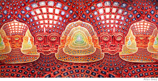
Retrieved from: http://www.alexgrey.com/net.html
This image is called "Net of Being", and is from Alex Gray's series "Sacred Mirrors", and is a 7.5 x 15 foot oil painting. I love this painting for the many layers that distort your perception of depth, and have spiritual and psychedelic connotations. It still amazes me how he managed to get such technical accuracy with freehand oil painting, and works really well with stereoscopic imaging which the band Tool used in their 10,000 days album cover. If you get the chance, definately look into it
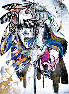
Retrieved from: http://www.grenomj.com/
For my second precedent I chose a painting by a young South Korean artist, Min Jae Lee. I really admire the vibrance and colour used in this painting while still managing to capture the emotion of the woman perfectly. I like the way the artist fragmented the whole painting like a shattered window, and managed to piece together so many textures into an amazing composition.


The words

I decided upon my three words quite sporadically, and at the time they all made sense to me in terms of explaining my precedents and forming a composition. It would take a very long time to describe just the thought process that got me here, but here are the words:

Incendiary (adj): Causing or capable of causing fire

Fungus (n): An organism of the kingdom Fungi lacking chlorophyll and feeding on organic matter

Entice (v): Provoke someone to do something through (often false or exaggerated) promises or persuasion

I can't wait to start shaping these images into something visually tangible :)