Tuesday 30 October 2012

Hand in for DSDN141 "Activate"

The last hand-in for first year. What a delight!

Here are the final image and video for the DSDN141 project "Activate", for which I was the output. My model has a speaker that outputs a specific frequency square wave that vibrates a bed of sawdust to look like a snow globe.

My main material was wood, and I wanted to investigate the property of "fluffiness" if you will - that when wood particles get really small they are really light and fluffy and when thrown in the air they have similar properties to snow. All the wood particles that I used inside the glass dome were carved from the block of wood used for the base


http://www.flickr.com/photos/liamgilbertsondesign/8138108314/

Thursday 18 October 2012

Project 3 Photograph & Render

Here is my photograph and final render for the DSDN104 Project 3 "Grow"


As my model was based off the golden ratio which is fundamentally based on patterns in nature I chose to photograph my model in a natural environment as if it were a naturally occurring object. This is also the reason why the model has been dyed green, as I feel it is the colour that best reflects nature. The model ended up having minor imperfections which I celebrated, as the Golden Rule is a rule for perfection to which most naturally occurring examples of the rule aspire to be but can never perfectly attain.


In my render I wanted to achieve the same objectives as my photograph, and replicate the photo but with my three models instead of just one. I chose a wood texture on stone pedestals as to suggest that the models are gifts from nature, with the internals being copper or gold, which are also naturally occurring gifts of nature. I also chose to light the insides of the models to give them depth, celebrate the internal spaces of the models, and also to enforce the idea that their metal insides were precious gifts. The pedestal for my final model as also been illuminated with a different colour light to show that it is different from the others.


Wednesday 17 October 2012

"Grow" Test Renders

I decided I wanted my renders to be of the same theme as my photograph, so I endeavored to have a render setup that mirrored the photo, but with 3 models.

I set my models up so that were all on their own individual pedestals, and set in a natural environment, and played with lighting and textures for each

Glass and Copper texture trial
 Here I wanted to trial the Glass textures to see if they would suit my models, and have the internals of the models as copper so that I could test the reflective and refractive qualities of each. Unfortunately the glass texture did not suit my main model well, as it ended up with total internal reflection causing the model to go black.
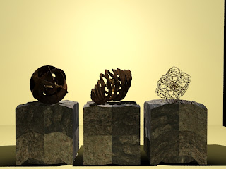
Wood and Stone texture trial
 Here I tested the stone texture I had on the pedestals to see whether it would be suitable, which I was quite pleased with - I just needed to work on the UVW mapping so that it was uniform with no edges. I also applied a wooden texture to all my models, which I felt worked really well and would provide a good surface to play with lighting effects. Ideally I wanted a semi-transparent texture to show off the internals of each, but I felt wood would be a more natural texture to go with my narrative, and lighting could be used to achieve the same effect.
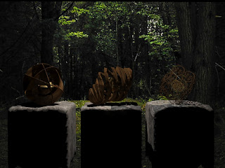
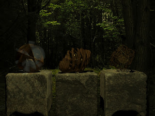
Background texture trial
 I really wanted my models to be in a natural environment, so I tested using this forest scene as a background for my render, which I feel worked very well. I found that it was near impossible to modify lighting effects of the forest scene, so I did these in Photoshop before importing them into 3DS Max.
Coloured lighting trial
 I tested using coloured lighting to see whether it would provide a more natural aesthetic to the scene, and I went with a yellow-green type colour as it might be filtered through a leaf, say. I was not particularly pleased with the effect, as it tinted everything to a strange tone which detracted from my models.
Volumetric lighting trial
 I tested using volumetric lighting to better present the models exterior, though I found that it looked both unnatural and detracted away from the internal space of the models, which is something I wanted to showcase.
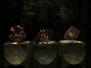
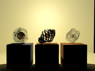
Spotlighting and Internal Omni lighting trial
 Here I put spotlighting on the models, both as a presentation aesthetic as it might be seen in a museum, but also to differentiate between the final model and the other two models. I was pleased with the effect.
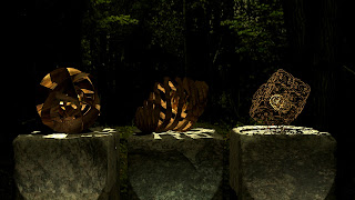
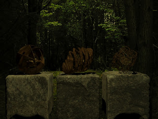
Omni lighting and 1080p cropping trial
Here is the final image, with changes to the Omni lighting for the scene which darkened the background to both make it look like a dusk scene, but also to strengthen the lighting effects of the spotlights and the internal Omni lights.

"Grow" Model Photographs

So I've got my model back! And it worked this time. Took ages to get all of the little bits of resin out of it, but I think it's looking pretty good. I decided to dye the model green, as I thought it was a colour that best indicated it's relationship to nature, which is also why I wanted to photograph it in a natural setting. I put the model an a stone like a podium, almost to indicate that it was a gift or a relic provided by nature.


Monday 15 October 2012

DSDN144 Project 3 "Light" Final Images

Here is my final set of images for the DSDN144 Project "Light", titled "Edible Abstractions"


For “Edible Abstractions” my aim was to use light and shadow to abstract four different items of food such that their images no longer reflected their original functions.

The choice to use food objects came from the reactions I had when walking through a supermarket past the fresh produce and bakery sections. I found that when looking at the produce my first and only reaction was one of hunger and how I could transform the ingredients before me into a tasty meal, and thought that anyone who viewed images of food would think the same. Consequently I decided to attempt to transform or abstract these ingredients so that not only their images were changed but a viewers reaction to them.

These images are all abstracted using different lighting situations, presenting each object with a select combination of coloured lighting, low exposure, shadowing and long exposures to achieve abstractions of transformations to varying ends. This series also used principals and concepts  from Sian Bonnell’s series “Scenic Cookery” which attempted to capture a similar aesthetic. 

I feel the series is relatively successful in regards to abstracting the objects, though in attempting to transform the objects into something different I found that simply modifying the lighting was alone not enough for an effective transformation, but putting a transformed object into a related situation (for example,  if it were a piece of fruit transformed into a building – placing it with a city as a backdrop) would have strengthened the transformation and thus the image much better.


Thursday 11 October 2012

Shoots for DSDN144 "Light"

Here are some of the images from my first shoot for the DSDN144 Project "Light".


My aim with this project is to use light and shadow to abstract food items and ingredients so that their images no longer reflected their original functions.

The choice to use food objects came from the reactions I had when walking through a supermarket past the fresh produce and bakery sections. I found that when looking at the produce my first and only reaction was one of hunger and how I could transform the ingredients before me into a tasty meal, and thought that anyone who viewed images of food would think the same. Consequently I want to attempt transforming or abstracting these ingredients so that not only their images were changed but a viewers reaction to them.

My intention is to present each object with a combination of coloured lighting, low exposure, shadowing and long exposures to achieve abstractions of transformations to varying ends. I really like the images  from Sian Bonnell’s series “Scenic Cookery”, the narrative of which is very similar to the concept I'm trying to achieve, and a lot of the techniques she has used in her images I will try to use for images of my own.

http://www.flickr.com/photos/liamgilbertsondesign/sets/72157631832465029/ 

For my first shoot, I tried using both natural lighting and low-level studio lighting for my images. For the broccoli photos I found that the images where I tried transforming the heads of broccoli into a forest worked best with the natural lighting, as a forest would usually be lit by natural lighting so it worked well for my transformation. The photos which worked best for this were also the ones where I only caught small parts of each piece of broccoli in the shot, as that was how trees would often be photographed in nature if you were in a forest, and it didn't immediately give away that it was broccoli in the photographs.

The low lighting for the broccoli I felt worked quite well, to me the shots looked quite eerie and organic, maybe like you might see in a scene out of Alien where some creature had created a nest. I also think that it was best to keep the lighting the same way without applying any colour filters to the light or the lens so that it would maintain that organic feeling.

The low-light photo of  the egg came out really well, though I originally intended it to look like lunar eclipse, but because of the kind of glass that I had it on also refracted the light a lot it didn't come out with the ring of light quite as I had intended it to.

As for the fennel bulb photographs, I feel there is still work to be done. I like how the lighting outlines parts of the object in a 2-dimensional way so that it doesn't necessarily give away what the object is, and I feel like it's a kind of alien spaceship that just landed, or like a agricultural water-tank at night, though I still want to investigate more angles of this setup. I think the lighting for it seems to be okay though.

For my second shoot, I like the angles I took for the fennel photos, and I thought that setting the image up so that it only caught certain parts of the fennel bulb abstracted the bulb even further, which I liked.

For the second attempt at abstracting the fennel bulb (after hacking the inside of it out and gluing it to retain it's shape) I thought it looked quite like a heart, so I tinted it red to look like one, which I felt worked really well. But because it lacked context, I decided to mask it onto a human. I only wanted the outline of a person just enough so that the position and colour of the fennel bulb indicated that it was a heart. The result of this was what I felt was the strongest image of my set yet.

As I needed another abstraction of an egg, I decided this time to open up the egg so that I could abstract the internals. I pulled out the yolk and fashioned an egg so that I could shine a light up through it and somehow suspend the yolk in the middle so that it was lit from below. Unfortunately I found that the egg yolk wasn't translucent enough when it was cooked to let the light through, so I instead cut the yolk into pieces and photographed it from above so that it would retain the same shape. This I felt worked really well, though my depth of field was too low to get both the egg and the shell in focus.

For my third shoot, I intended to clean up the technical mistakes that I had from the first two shoots, and involve another fruit; the capsicum.

Ever since I was a child, I've always wanted to turn capsicums into a traffic light. I mean, just look at the colours of them. I couldn't help myself. So even if it came out as an image that didn't work so well for my set, I've at least satisfied one of my childhood dreams.

I was tempted to photoshop the traffic light image onto an actual traffic light pole, but I thought it was obvious enough from the image alone that it was what I had intended, and maybe putting the image into a context would have detracted from the image itself so I decided against it.

I found that the image I had done with the egg with the lighting from below had worked really well, so I decided to do the same thing for the seed-head of a capsicum. I felt this abstraction worked really well, as it was really hard to work out what it was for many people, and it looked like so many different things as well, like a brain for example.


Monday 1 October 2012

"Grow" Third Model Development

After having a play around with the Fibonacci Spiral I decided I wanted to directly use an extrusion of the spiral so that it would mimic the shape of one of my precedents


I decided to try using the Golden Ratio on a vertical plane as well as a horizontal plane, so that as the shape spiralled out it would spiral up as well, like this shell.


A lot of the problem I had with making a spiral like this was the attempting to make it precise and perfect. Doing this is Solidworks was a huge challenge, and though it would have make a very precise model it did not give me the creative control I wanted. I look it into 3DS Max, and used the soft selection and move tools to extrude the spiral, and manually welded a mirror image of the spiral to itself to make the above shape.

I decided that precision and perfection when making this model wasn't required, and in fact it would have been better if it had little imperfections in every different part of the spiral so that it would come of as a more natural object; perfection is an unnatural concept, where forms in nature or even man-made forms aspire to an ideal (whether real, imaginary, or in another dimension), and natural objects are full of imperfections. In my mind beauty is in the little imperfections, so I bent little parts of the spiral using the soft selection tool.


I decided I wanted to make a whole bunch of spirals stacked on each other so that it would forms a lattice in effect that could contain an object, like a seed or fruit. It was quite challenging making this, as the spiral I had made wasn't perfectly symmetrical, so it all had to be done manually....


...... so I used a rod as a point of reference to come out with.....


This! Inside is a model I had previously made which I wanted to use as a seed inside a piece of fruit, which I selected from these:


I chose the ball I made from a Mobius Strip that I made as part of a different family, as I liked the philosophical and physical connotations it had, how the shape resembled a man made version of the same spiral I had made from natural origins, and for the idea that a natural environment contained and mothered a man-made object - quite like the earth.