Friday, 30 March 2012

Research Statement and Annotated Biblioghraphy


The following are resources for my research into the fundaments and principals of neo-classical design.

Book:  Neo-classicism A&I (Art and Ideas)
This book is a broad study of Neoclassicism covering every aspect and manifestation of the Neoclassical style ranging between the artisan to the utilitarian, from the style's first appearance to the style's decline and appearances in modern society. This publication will assist in my definition and understanding of Neoclassicism as a whole. [1]

Journal Article: Neo-Classical Aesthetics of Art and Science: Herman Helmholtzand the Frog-Drawing Machine

This article covers specifically the mathematical and scientific interpretation of Neoclassical Design, and speculates on the method for which the style can be manipulated and recreated in modern society. This will become useful for my research on the contemporary understanding and application of the style. [2]

Edited Book: Neoclassical and 19th Century Architecture

A publication that examines the cultural trends of the neoclassical period, and the architectural as a result, this book will assist my research by helping my understanding of the society that influenced and developed neoclassicism as an architectural and artistic style. [3]

Website: http://www.metmuseum.org

This website provides a timeline of artistic and design movements including Neoclassicism. This website will help my research by placing the style into a chronological context with many references to images and articles that will also assist in understanding the fundaments of Neoclassicism. [4]

Image: Baltimore Basilica

This image provides an insight into the architecture and design of the first basilica in the United States to be built in this style, and is an inspiration for my research into the style as a whole. [5]


Bibliography

1:  Irwin, J. (1997). Neo-classicism A&I (Art and Ideas), Pg 1-447, Los Angeles, USA: Phaidon Press

2:  Wise, M.N. (2007), The Hans Rausing Lecture, Neo-Classical Aesthetics of Art and Science: Herman Hlmholtzand the Frog-Drawing Machine (No. 10),1-52.

 3: Middleton, R. (Ed.) (1980), Neeoclassical and 19th Century Architecture, New York: Abrams

4:  Heilbrunn Timeline of Art History, Neoclassicism, Retrieved from http://www.metmuseum.org/toah/hd/neoc_1/hd_neoc_1.htm

5: Greim, J. (2011), Baltimore Basilica, Retrieved from http://www.artwanted.com/imageview.cfm?ID=1092361

Wednesday, 28 March 2012

Individual Work - Axonometric


Liam Gilbertson - Individual
Precedent - Source: http://dsdn101.blogspot.co.nz/p/readings.html
For this drawing I decided to research a technical drawing style used in Architecture, and found that many buildings were drawn in an Axonometric perspective. I found this intriguing because despite distorting an image to unrealistic proportions, Axonometric perspectives allow you to measure dimensions directly on and off your drawing without scaling as you would with, say, isometric. My precedent also showed a range of motion which I have replicated and tried out using varying line weight to show movement.

Tuesday, 20 March 2012

Design Persona

I am a design student with a visual-spatial mind and I pride myself on composing logical decisions. My name is Liam, and I was born and raised on a farm near Lower Hutt, where I developed a practical capability rebuilding tractors and constructing sleepouts, and challenged my affinity for crafting and enhancing structures of my own design.


My decision to study design stems from my passion for creation; I find myself truly in my element animating my ideas into physical form, whether it's building a go-kart or folding a new kind of paper plane, I find immense satisfaction in bringing a concept into fruition. I aspired to develop new and innovative methods of transport based on alternative energy sources; one of my inspirations here is Henry Ford. I admire him for his ability to not only develop an idea, but a new way of thinking that led to the foundation of the mass production industry as we know it today.

I originally pursued a degree in Mechanical Engineering in the hope that I would gain a toolbox of skills that I could use to develop and convey my ideas in a logical and definite fashion. I found however that this degree focused mainly on the science and constraints surrounding a physical structure and very little on an object's design. 

This is when I discovered the Bachelor of Design Innovation. To me, the skills to be gained  in this degree represented pure creation; it would help me develop my ability to visualise and compose an idea  in a variety of mediums, to adapt and extend these ideas with reference to design principals from both recorded history and emerging technologies, and solve colloquial problems in my own unique way.

Friday, 16 March 2012

Help with "Design Persona" statement

So we've been asked to write a "Design Persona" statement. And if you're like me, you're having trouble trying to sum yourself up in 300 words. Well it may please you to know that we're not alone in this.

The Walker Art Centre is a famous contemporary art museum and institution in Minneapolis that also has a number of blogs. One of these was a guest blog (a blogger by the name of KDD) where one of the institution's design candidates was asked to write an artists statement - and had trouble with capturing the true essence of himself as an artist.

"I decided to reach out to practicing designers whose work I admired by posing the following question:
Is there such a thing as a “designer statement,” and if so, how would you go about creating one?" - KDD

The responses to he received to this question come from artists in all fields in the arts - Graphic Designers, Performing Artists, Painters, and more, and cover many different perspectives on what it means to be an artist. I think you'll find their opinions most interesting

If you want to check out the blog there are multiple parts. You can view the first part here

Good luck for Monday!

Thursday, 15 March 2012

Blast from the Past

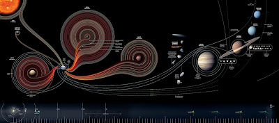
I was trawling the interwebz having a look at different styles for a little bit of inspiration, where I came upon a website containing a bunch of nifty little infographics - a style of design I had completely taken for granted. Take this awesome space exploration infograph for instance!

by Sean McNaughton and Samuel Velasco for National Geographic. Source: www.hongkiat.com
Suddenly I was reminded (with no pun intended) of my favourite video clip from one of my favourite bands, "Remind Me (Someone Else's Remix)" by Royksopp. I really like the insight into the almost monotonous daily workings of an office worker, and I simply adore the quirky infographics spanning from alarm clock function to the process of milking cows, from percentages of fast food consumption during office lunch to train networks and more. Seems MTV Europe loved it too - it won Best Video in the 2002 MTV Europe Music Awards. Check it out!

Wednesday, 14 March 2012

Helvetica


In essence, type is a mode of communication - a way of displaying information and ideas in a formulaic manner for a reader to digest and ideally understand. By extension, a font is a set of type that displays itself in a particular style.

Much like a wasp has a yellow and black abdomen to caution other animals, or a woman might dress in red to display an image of lust and health, font gives text a particular fashion to provoke an emotional response to the reader. 

Helvetica is a font that is clean, easy to read and universal; it is a colourless vessel created with the intent of communicating information as efficiently as possible. Because the font itself does not come attached with an inherent character besides efficiency, sometimes the only emotion that can be derived from the font is from the words used in the text.

This is why I like this quote of David Carson's so much. It reminds us that communication is not entirely dependent on our ability to read, or even language in general. Many ideas and emotions can be conveyed in other modes such as colour, texture, sound or gesture to name a few, and though Helvetica is a stable medium for conveying a language often much of the meaning and emotion of the text could be portrayed better, maybe in another font.

- David Carson

Sunday, 11 March 2012

It's a daunting place, the Interwebz

Well, I've finally done it. My first ever blog post.


It took me a lot of courage - I sat here staring at my computer wondering if I would ever get up the gusto to actually do it. Sure, I know it's not that hard. But it felt like I was an author at the start of a novel; How do you start? What should it be about? What do I even say?
Your first time is never going to be that great. You'll never say exactly the right thing, maybe end up offending a whole bunch of people, it'll end all too soon and you'd wish you could go back in time and change everything but you can't. You just have to throw yourself in there, and before you know it you'll move on to better things.

So there you have it! I'm really looking forward to this, I can see blogging becoming quite addictive. But if I start to ramble about how I get frustrated when I see those stains that bottles leave on your table when you don't use a coaster or anything like that, just stop me okay? I don't want to become a reclusive twittering twat confined to month-old forums dribbling on my keyboard :)

Does... Does all that remind you of anything?

Nah.